Currently many political discussions and decisions are dominated by new increasing SARS-CoV-2 cases. However, as these numbers are dependent on the precision of the corresponding tests it is wise to be cautious in making predictions solely based on these numbers, e.g. out of 1.5 Mio tests, 22500 tests might be positive just by chance (assuming a 1.5 % false-positive rate). However, looking at excess mortality (sometimes referred to as mortality displacement https://en.wikipedia.org/wiki/Mortality_displacement) during the SARS-CoV-2 pandemic seems to be a more unambiguous approach since the false-positive rate of death should be negligible ;-).
A few months back I had a discussion with a colleague about excess mortalities in the context of Corona. One of the statements of my colleague was: “The excess mortality in Italy was significantly higher this year due to Corona.”. This statement somehow caught my attention because I have to admit that I only had a rather fuzzy understanding of what excess mortality actually meant, especially how it was estimated. I am pretty sure the same was true for my colleague. Thus, I dug into the literature and checked how excess mortality is typically estimated. I found various methods including smoothing and curve fitting techniques. In this blog-post I will go a little bit into detail about the latter one and give a brief introduction about generalized linear models (GLM) that are often used to fit these kind of data. Using this and other techniques I found that (a) my colleague was wrong concerning Italy (as you’ll see based on the available data this statment cannot be verified) and (b) that many other European countries did not show exceptional excess mortalities during the SARS-CoV-2 pandemic either which was somehow surprising, especially since they are in contrast to what is typically reported on public news channels (if you remember the images from Bergamo in Italy). I link the full MATLAB code that was created to perform the analysis. It can thus be reviewed and proof-read. If there are any mistakes, please let me know. Let us start with a very brief introduction to GLM.
Generalized linear models and Poisson Regression
To understand generalized linear models it might be good to start from something that will likely be well-known to you, namely- conventional linear regression. Conventional linear regression assumes that the relationship between the measurement variable  and the independent variable
  (predictor) can be modeled as follows
![\[\mathbf{y} = \mathbf{X}\mathbf{b} + \mathbf{\epsilon}\]](https://dataanalysistools.de/wp-content/ql-cache/quicklatex.com-6c4cd9459bdf227e6cf855697bfe02e9_l3.png "Rendered by QuickLaTeX.com")
Herein ![\mathbf{y} = [y_1, \dots, y_n]^T](https://dataanalysistools.de/wp-content/ql-cache/quicklatex.com-bcb39a91cab57f2668e88ee35b281756_l3.png "Rendered by QuickLaTeX.com") denotes the vector of the measured data,
denotes the vector of the measured data,  the so-called design matrix (Jacobi-Matrix),
 ![\mathbf{b} = [b_1, \dots, b_m]^T](https://dataanalysistools.de/wp-content/ql-cache/quicklatex.com-2a232d0e1c0fece672f51f1df55eb025_l3.png "Rendered by QuickLaTeX.com") the vector of model parameters and
the vector of model parameters and  the vector of the residuals which are, at least in conventional linear regression, assumed to follow a standard normal distribution with mean
  and variance
  . This basically means that each is a random variable following a normal distribution with mean
  and variance . Please note that
  denotes row (vector)
  of the design matrix.
  is supposed to build the whole regression line, i.e.
![\[\matbf{\mu} = \mathbf{X}\mathbf{b}\]](https://dataanalysistools.de/wp-content/ql-cache/quicklatex.com-bd03f8b824775884fc95917f2add99dd_l3.png "Rendered by QuickLaTeX.com")
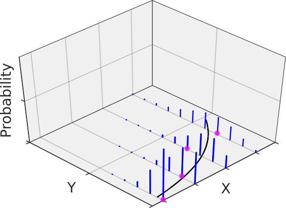
I tend to think of this as  -values spreading around the regression line at each predictor value where the spread is given by the variance (or better: its standard deviation) and thus each (magenta in Figure 1) is a sample from the underlying normal distribution (Figure 1).

The model parameters  are not known precisely but are estimated by fitting the model to the data. This is typically done via a least-square approach by minimizing the sum of the squared distances of the data points from the regression line.
In generalized linear models the relation between the mean and the linear predictor is more general and can be of the form:
![\[g(\mu) = \mathbf{X}\mathbf{b}\]](https://dataanalysistools.de/wp-content/ql-cache/quicklatex.com-738979a9fbc90bd63ec74ac261090765_l3.png "Rendered by QuickLaTeX.com")
 is typically called the link-function as it links the linear predictor to the mean. Additionally, the -values are allowed to be sampled from other distributions than the Gaussian including the Bionomial or the Poisson distribution (just to name the two most common ones). For the latter one the log of the mean is directly related to the linear predictor:
![\[log(\mu) = \mathbf{X}\mathbf{b}\]](https://dataanalysistools.de/wp-content/ql-cache/quicklatex.com-c350269508d24b2e7524748ad136c995_l3.png "Rendered by QuickLaTeX.com")
Thus, we have a log-link function in the Poissonian case (note that the  is supposed to be the natural function here). The following figure gives an example where the measurement data at each predictor follows a Poisson distribution with its own mean and thus its own variance in blue (remember from graduate school math: the variance of a Poisson distribution is equal to its mean, at least unless the data is not over-dispersed -> quasi-Poisson). Having many replicates at each predictor would reveal the increasing variance with increasing precitor values.
The Poisson distribution is especially helpful when dealing with counted data and thus was the distribution of choice for the generalized linear modelling (GLM) of the weekly mortality data (for details, see the MATLAB code). By the way, a GLM regression with Poisson distribution and log-link function is sometimes referred to as Poisson regression.
Using Poisson regression to model the weekly mortality baseline
Basically, I used a quasi-Poisson as my distribution in accordance with the Flumomo method to model the baseline of the weekly mortality data. However, I found that either using a Poisson or quasi-Poisson actually did not influence the final outcomes, although the confidence intervals of the fit parameters and confidence bands of the prediction curve were slightly broader in the latter case (as expected). As a linear predictor, I used the following model:
![\[\mathbf{Xb} = b_1 + b_2 \sin\left(\frac{2\pi}{365.25/7} \cdot x \right) + b_3 \cos\left(\frac{2\pi}{365.25/7} \cdot x \right) \]](https://dataanalysistools.de/wp-content/ql-cache/quicklatex.com-ac0bae333622dddac27ea3e8c92783d5_l3.png "Rendered by QuickLaTeX.com")
Please note that this is a linear model (since the equation is linear in the parameters ). The equation above models the baseline of the mortality trace. At some time point  excess mortality was observed if
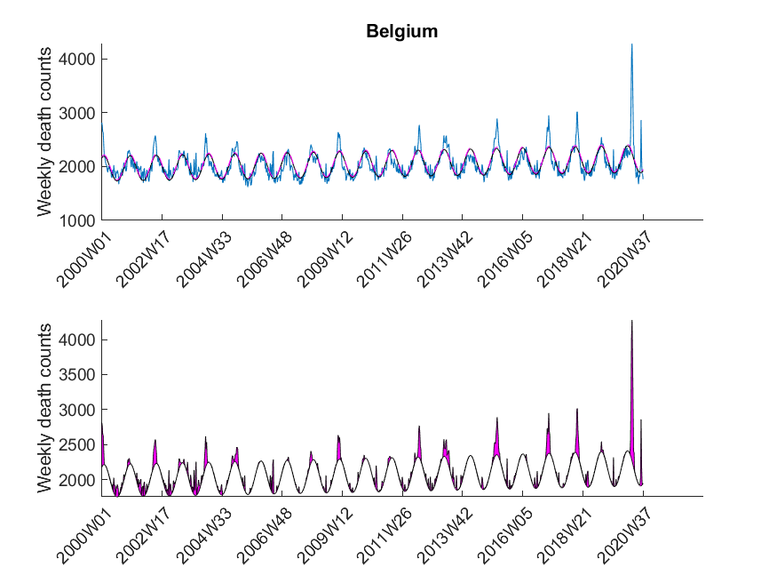
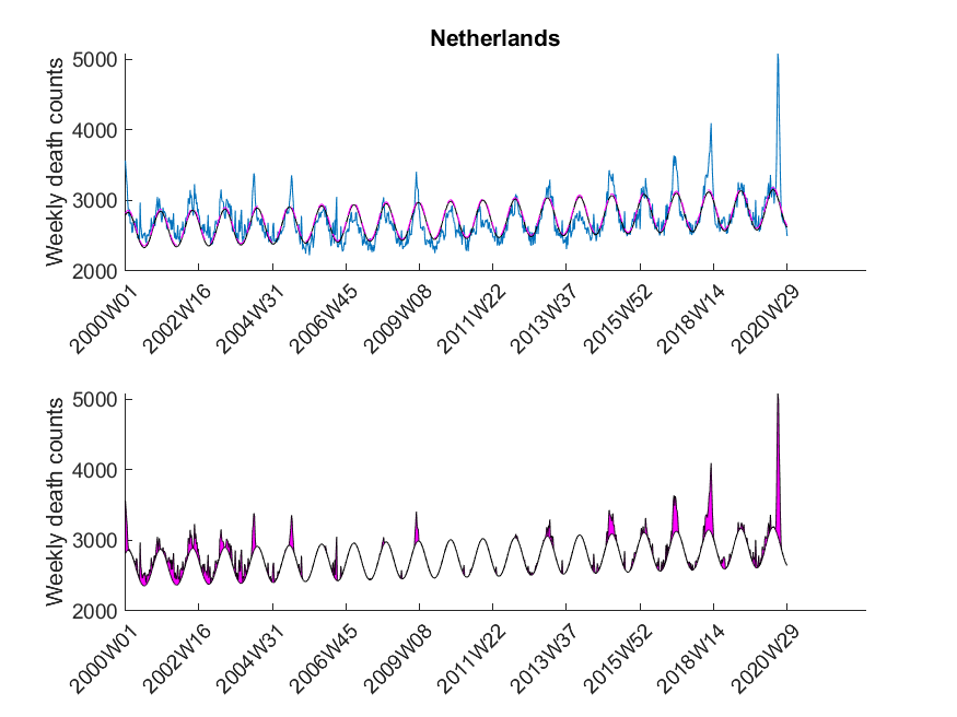
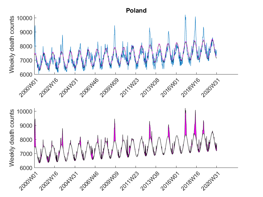
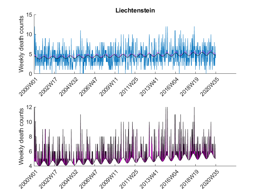
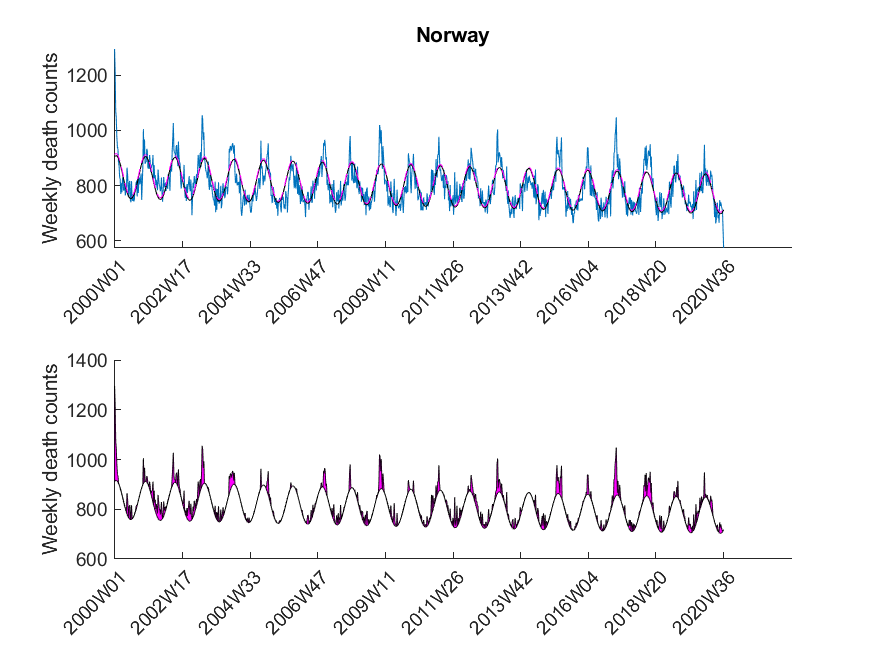
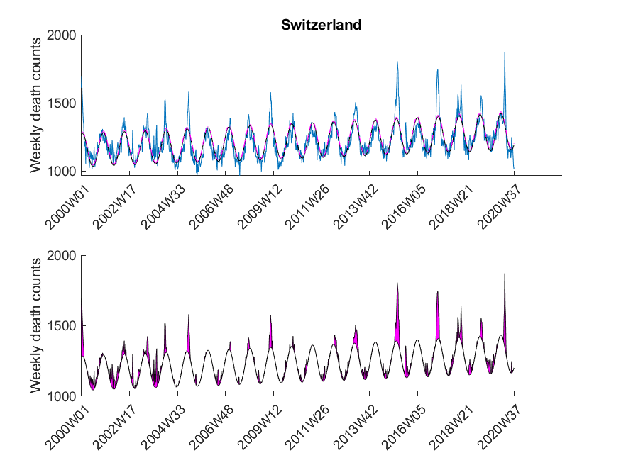
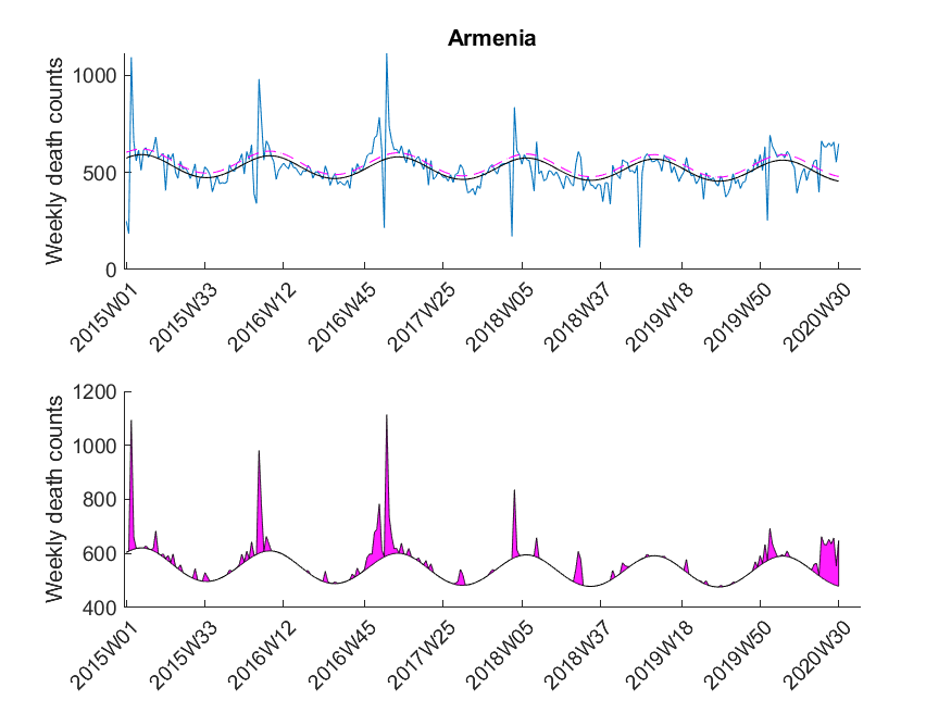
  exceeded the value of the upper 95 % confidence limit of the baseline curve (dashed line in Figure 3). At that point it might be interesting to note that the estimated baseline peaks in winter. Small pandemic breakouts add additional peaks on top of the baseline (as in the flu season 2018, see Figure 3).
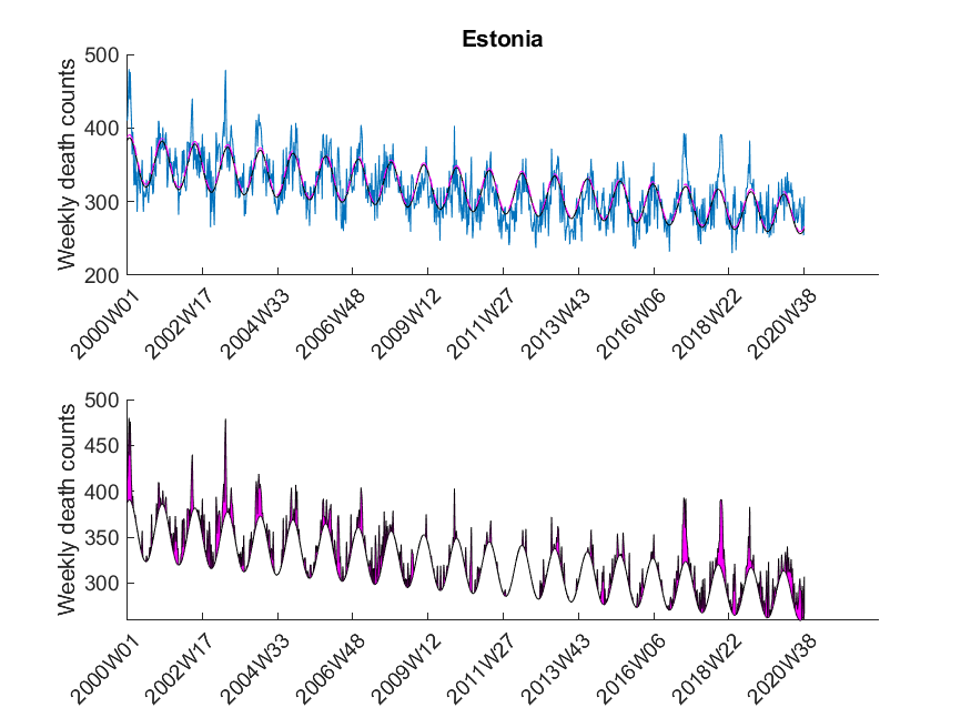
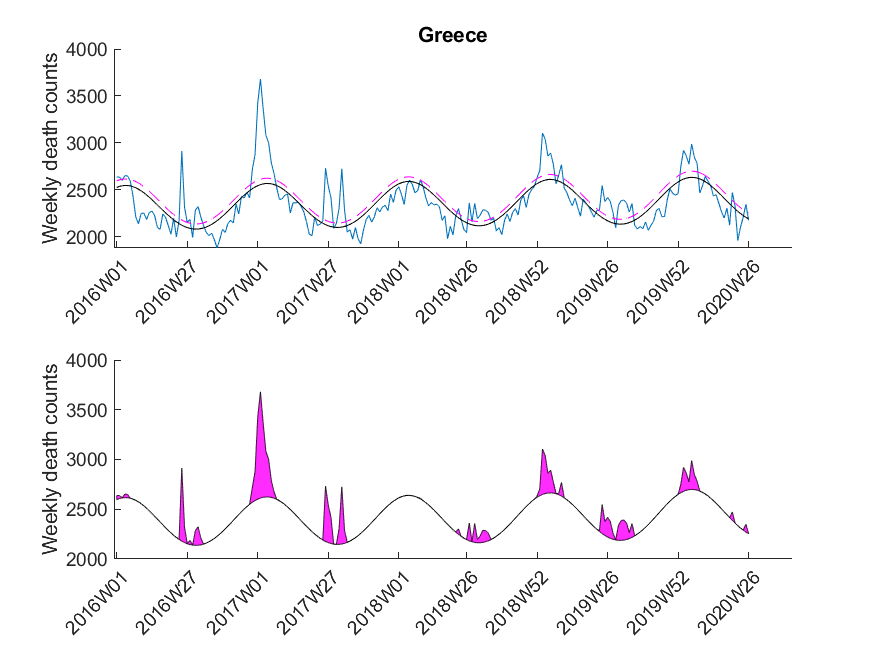
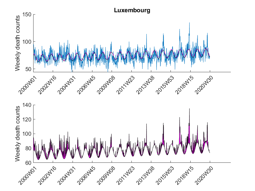
Here I was interested in the excess mortalities during the winter months (gray shaded area in Figure 3). For the exact range definition, see the MATLAB code. Thus, starting from each local maximum of the baseline I looked at several points left and right for excess mortalities and calculated the area under curve of the excess mortality peaks (magenta-shaded in Figure 3) and did not compare the absolute values of the local maxima of the excess mortality peaks. Subsequently, I compared these areas with the area for the peak of the SARS-CoV-2 season at the beginning of 2020 in a statistical manner using a one-sided Wilcoxon signed rank test. This was done to test in which countries the excess mortality due to SARS-CoV-2 was significantly higher compared to the excess mortalities of previous years. The following table shows that about 30 percent of European countries showed significant excess mortalities in 2020 compared to previous years.
| Country | Excess mortality higher in 2020? |
| Belgium | True |
| Bulgaria | False |
| Czechia | False |
| Denmark | False |
| Germany | ND |
| Estonia | ND |
| Greece | ND |
| Spain | True |
| France | True |
| Croatia | False |
| Italy | ND |
| Cyprus | False |
| Latvia | ND |
| Lithuania | False |
| Luxembourg | True |
| Hungary | False |
| Malta | False |
| Netherlands | True |
| Austria | False |
| Poland | False |
| Portugal | False |
| Romania | ND |
| Slovenia | False |
| Slovakia | False |
| Finland | False |
| Sweden | True |
| UnitedKingdom | True |
| Iceland | True |
| Liechtenstein | False |
| Norway | False |
| Switzerland | True |
| Montenegro | False |
| Albania | ND |
| Serbia | False |
| Andorra | ND |
| Armenia | False |
| Georgia | False |
One can now start speculating why some countries had no exceptional excess mortalities during the Corona pandemic and some had. But I think that this problem is multi-factorial and cannot simply be described by only one factor (e.g. health care system). What I personally find interesting is the fact that some countries (like Germany) had a complete lockdown although there was only a negligible excess mortality around the time of lockdown.
There are various aspects that are not ideal with the analysis presented here:
- The weekly mortality traces for some countries are rather short including Italy and Germany.
- Some countries are far bigger than others and the outcome for these might thus be more reliable.
- The range that was chosen around the baseline peaks (e.g. see gray-shaded area in Figure 3) might not be appropriate for each country and is, to some extent, subjective.
- As SARS-CoV-2 first occurred at the end of 2019, there is only a single point that can be used for the comparison with previous years. It might be interesting to repeat this analysis once we have more data available.
- I chose a significance level of
 which is not based on any deep investigations but rather due to the fact that it is more or less standard in science. Depending on the decisions derived from such an analysis, another
  might be desirable.
 - The analyzed data does not discriminate between different age groups. Performing the same type of analysis would probably reveal different results in the group of elderly people.
Please note that I was mostly interested in presenting the method (i.e. GLM) to you than delivering perfectly accurate results. In any case it is advisable to read peer-reviewed publications on the SARS-CoV-2 pandemic results, although I have to admit that nowadays it is difficult to not be overwhelmed by the publications and news of public media. To some extent they cover scientifically valuable publications just because the latter have less search volume. Thus, even as a scientist it is really difficult to find good and useful scientific information during this pandemic.
The data was downloaded from EuroStat website September 29th. The data was subsequently cleaned in Excel to be imported in MATLAB. The Excel sheet is available on our Software page. Please note, mortality traces of different countries started (and sometimes even ended) at different time points, and thus, the graphs (below) show differnt time frames.