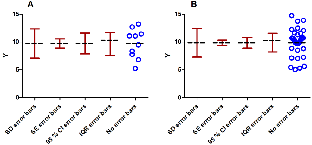
I have seen many publications with beautiful colored graphs including well-formatted error bars. Unfortunately, a lot of these publications do not state what these error bars represent. If not stated in the figure’s caption, one starts to look at the main text. In the worst case it is not even stated there. If the data points are plotted in the same graph, one can sometimes guess what type of error bars might be shown, but if the data is missing, this becomes difficult. It might seem tempting to use those types that are very narrow, e.g. use standard error bars instead of standard deviations (for the difference between the different types of error bars, please go on reading) but the choice of the error bar type should depend on what you want to show with your data. Often, it is even better to leave error bars completely aside and simply plot the data points. If you choose to plot error bars keep in mind that there are various ways to do so. The most common error bar types are those derived from standard deviations (SD), standard errors (SE) or confidence intervals (CI). The SD is a typical measure of the scatter in the data set and can be viewed as the average distance of the data points from the mean. Increasing the sample size will not narrow SD error bars (of course, the sample standard deviation will be a better estimate for the true SD for larger sample sizes). When comparing two group means, do not use SD error bars. It is a misconception to think that the two group means are significantly different if the SD error bars do not overlap. In general, this is not true. Nevertheless, non-overlapping SD error bars can be regarded as a positive sign if you aim for a significant difference of the means in practice. It is also not true that overlapping SD error bars indicate a non-significant difference. Only an appropriate significance test (e.g. Student’s t-test) might reveal statistical significance. Error bars based on the SE or based on CIs are sample size-dependent. The SE denotes the standard deviation of the mean, of some fit parameter or some other derived statistical quantity and is simply the sample standard deviation divided by the square root of the number of data points. Increasing the number of data points thus decreases the standard error and narrows the corresponding error bars (see Figure 1).
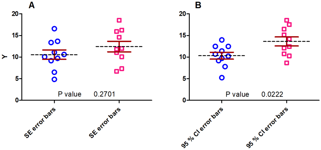
I saw students using SE instead of SD error bars only because the former ones were narrower. However, this is not the right reason to use them. They might be used to compare two or more data sets for inferential purposes. As a rule of thumb: If two data sets have comparable sample sizes and if the SE error bars of the two groups overlap then the two means cannot be considered significantly different. In general, if the SE error bars do not overlap one cannot say that the group means are significantly different. However, with CI error bars this statement can be made (at least for comparable sample sizes of the two data sets). If the CI error bars do not overlap, the group means are significantly different. Figure 2 gives an example for both the overlapping SE error bars (A) and non-overlapping 95 % CI error bars (B) with their corresponding p-values near the x-axis. To be on the safe side in practice, I recommend performing the appropriate hypothesis test such as the Student’s t-test or a one-way ANOVA in order to assess statistical significance and the corresponding p-value.
When looking at Figure 1 and Figure 2, one might come to the conclusion that all error bars are symmetric. Nevertheless, looking closer at Figure 1 reveals that the interquartile range (IQR) error bars are not. Symmetric error bars suggest a symmetric underlying distribution. However, e.g. if the data follows a lognormal distribution rather than a normal distribution, it might make more sense to use the geometric SD instead of the normal SD for the error bars since the former one resembles the dispersion of the data better. Instead of being added (upper whisker) or subtracted (lower whisker) from the mean, the geometric SD is multiplied (upper whisker) or divided (lower whisker) from the geometric mean and can thus appear asymmetric on a linear scale.
To summarize, it is worth thinking about if error bars shall be plotted at all and if yes, which type of error bars shall be used. SD, quartiles or other descriptive measures error bars might be used to demonstrate the dispersion of the data while SE error bars and confidence intervals might be used for assessing significant differences between groups.